Disappointing Job Gains Suggest Economy is Still Recovering from Pandemic Recession
April 2021 Jobs Report Analysis
The U.S. economy added 266,000 jobs in April 2021, according to the Bureau of Labor Statistics Jobs Report released on May 7th. This would have been excellent news a few years ago, but in an economy still trying to recover from the Coronavirus recession, this news was anything but excellent. Instead, it serves as a reminder that the economy still has not recovered, that we should continue doing everything we can to facilitate economic recovery, and that – as you can see in the graph below – the pandemic is also not over.
We are still making progress economically and towards vaccinating Americans against COVID-19, but now is not the time to become complacent; we should remain vigilant for at least the next few months. Once we have truly turned a corner, then we can all let out a sigh of relief. Until then, we should celebrate what progress we have made without losing focus on what else must be done.
People across the country are increasingly returning to the labor force, but because of direct and indirect disruptions caused by the pandemic, this transitionary period will undoubtedly entail a degree of volatility as employers and workers respond to such disruptions. April’s job numbers seem to reflect the difficulty in achieving such a delicate balance.
April 2021 Job Gains and Losses
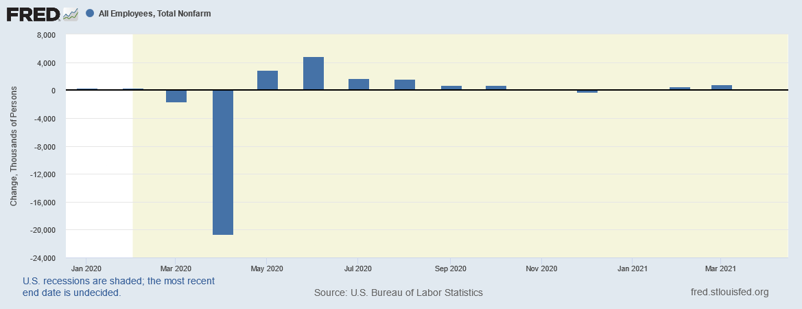
To put April’s jobs numbers into perspective, let us once again look at a graph of monthly changes in job numbers since the beginning of 2020.

Putting the 266,000 jobs on the same graph as the more than 20 million jobs lost in April 2020, it is difficult to even see the bar representing April 2021 job gains. Before you start grabbing a magnifying glass, let’s instead analyze job gains since 2021 for a better look at how this April’s figures compare to the rest of the year’s gains.

Now you can see April and January 2021 and how their figures compare to those from February and March of this year. If you read my previous article on the Jobs Report, you might be thinking that March’s numbers seem different from what you remember. Initially the BLS reported that there were 916,000 jobs added last month, but after revising this number throughout April, they determined that only 770,000 jobs were added in March 2021.
Revisions happen frequently, since the BLS receives and reviews more data all the time, so this downward revision is unfortunate if not necessarily unexpected. You might recall some of the BLS graphs we’ve examined before which include “confidence intervals” for certain data points, where there will be a red dot showing their current best estimate, along with shaded regions showing the areas that represent the range of values where they are 90% certain the true number could be.
These shaded regions get smaller and smaller over time as more information is known, survey data is double checked and clarified, and the BLS is more confident in what the true number is. Below is one such graph, showing this month’s changes in jobs broken down into industries, along with 90% confidence intervals.
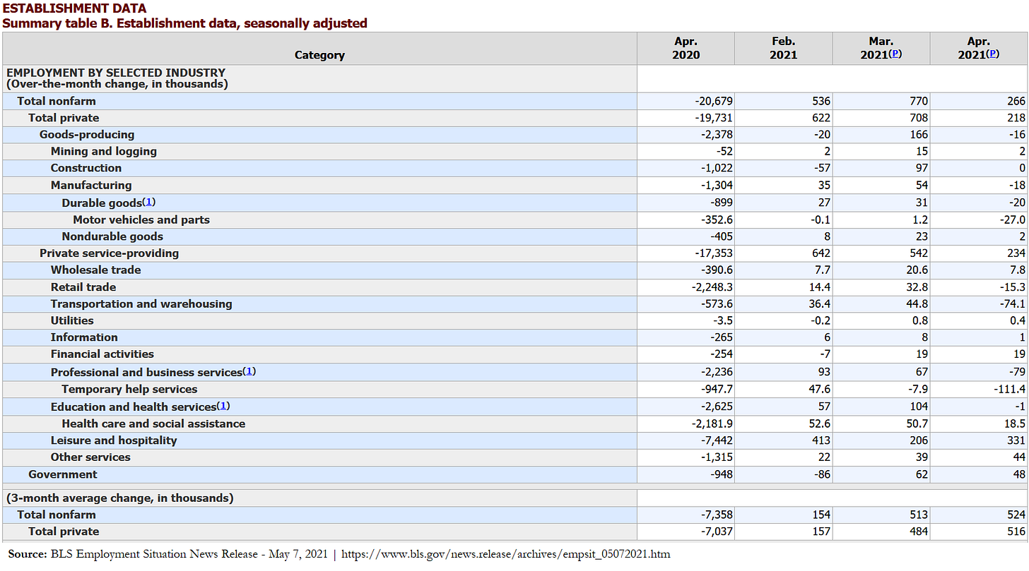
The above chart gives you an idea of the general trends in different sectors throughout April 2021, with job gains to the right of the “0” line and losses to the left. To get a better idea of exactly how many jobs these data points represent, we can turn to the table below. It shows April 2021 figures in the righthand column, the prior two months to the left of that, and April 2020 for added context to the left of those.
Once again, the leisure and hospitality sector saw the greatest net increase in jobs, adding approximately 331,000 jobs. Although prior months have been revised, the leisure and hospitality industry remains the strongest overall sector for job growth over the past three months, with an average of roughly 316,667 jobs per month since February 2021. However, you can see that during April 2020, this sector also lost more jobs than other industries during that devastating month, with nearly 7.5 million leisure and hospitality jobs lost when so many restaurants and hotels closed.
While the leisure and hospitality industry is steadily adding jobs as pandemic restrictions are gradually being lifted, other industries unfortunately saw little change or suffered net losses. Manufacturing jobs, including motor vehicle and parts manufacturing, lost jobs, while construction, mining and logging jobs changed little.
My suspicion is that resource bottlenecks in these industries are impacting such job losses, like the computer chip shortage affecting several industries, from car manufacturing to video game consoles, and the lumber processing backlog exacerbated by pandemic trends and disruptions. Service industries had a broad mix of gains and losses, with temporary help services suffering the most losses, followed by transportation and warehousing.
Despite a net increase in jobs throughout the month, the official unemployment rate rose by 0.1% to 6.1%. What’s more, workers who are among the 9.8 million unemployed are increasingly long-term unemployed workers. The White House Council of Economic Advisers prepared a graph showing the percentage of workers who have been unemployed for more than six months or more than a year, shown on the graph below as 27+ weeks and 52+ weeks, respectively.

While the red line representing those unemployed for six months or longer is showing signs of slowing, some of those workers are remaining unemployed and adding to the blue line’s upward trend. If the Senate would pass the American Jobs Plan, perhaps we could reverse this trend while investing in better, cleaner infrastructure. Although the unemployment rate and the percentage of long-term unemployed workers are both increasing, these increases occurring alongside a net increase in jobs suggests that the overall labor force also increased.
Labor Force Participation and the Lack of Family Care
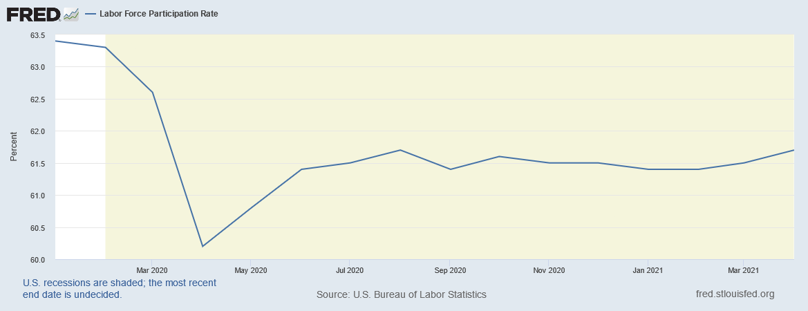
The labor force participation rate (LFPR) increased by 0.2% to 61.7% during April 2021 as more people began to actively seek work, but the details complicate this piece of otherwise good news. On one hand, the graph below shows how the labor force participation rate is rebounding after roughly a year of slight ups and downs, following the sharp decline in April 2020.

However, although there was a net increase of approximately 330,000 people entering the labor force, more than 100% of those were men; women left the labor force overall. The graph below shows the labor force participation rate in green, along with the LFPR for men and women in blue and red, respectively.

You can see that all three curves dipped sharply last April, and there have been slight ups and downs throughout the year since then, but women’s LFPR flatlined in April 2021 as a result of 165,000 women 20 years of age or over leaving the labor force. Meanwhile, the blue line representing men’s LFPR is trending slightly upward. While labor force participation is trending upwards overall, there are steps we could take to ensure that this transition is more equitable.
Perhaps if the American Families Plan were enacted, mothers and care givers would not feel the need to be in two places at once – both seeking work while also caring for family members at home. Perhaps then they would also be able to take paid leave when necessary, benefit from universal childcare, and return to work once they can ensure their family’s wellbeing. Instead, since roughly one quarter of schools currently remain closed, and some children are just beginning to be vaccinated, while tens of thousands of new cases of COVID-19 and its variant strains spread throughout the country each day, it is not yet entirely safe for children to return to school or daycare centers. This may change by the Fall when a new school year begins, but until then, the road to recovery will likely remain bumpy as everyone strives for a proper balance between health concerns and resuming economic activity.
I hope that May 2021 will bring good news, both in terms of stopping the spread of COVID-19 while increasing vaccinations, and also getting people into good, well-paying jobs with safe work environments. Beyond examining data each month as new information becomes available, it is also important to analyze longer-term trends.
Three-Month Trends
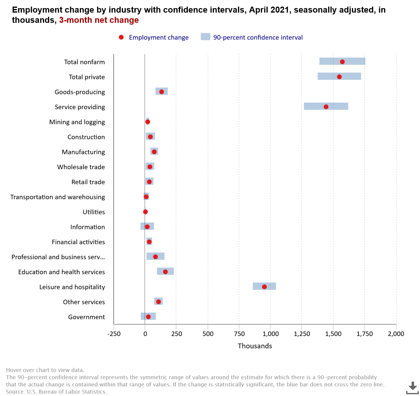
Because jobs numbers can be volatile from month to month, especially during a transitionary period beset with so many disruptions and such uncertainty, analyzing broader trends can help paint a smoother picture of what workers are experiencing in this labor market. The following chart, for instance, shows the jobs numbers for various industries since February.
While many sectors show fairly strong growth over the past three months, others are stagnating or showing risks of net losses, depending on whether the final figures are revised up or down. Government jobs, shown at the bottom of the chart, have the left side of its shaded confidence interval ending to the left of the “0” line. But overall, the U.S. economy added roughly 1.572 million jobs throughout the past three months, averaging 524,000 per month. Hopefully in the coming months, leisure and hospitality will continue adding jobs, and the struggling industries will once again pick up momentum.
Future Articles – Labor Shortage and Inflation Debates
While I had initially planned to discuss the ongoing debate surrounding a possible labor shortage in this article, upon doing further research, I began to feel that the topic was complicated enough to warrant its own article. Republican governors are nevertheless acting with the certainty of people using recent events to justify a forgone conclusion, rather than allowing circumstances to guide policy.
A forthcoming article will discuss the unemployment benefits being revoked by these governors, their arguments, and whether their reasoning lines up with the facts. My preliminary research suggests that the reality is more complicated than job openings miraculously being filled once unemployment checks are no longer being sent out. You may also recall that my stance on enhanced unemployment benefits throughout this pandemic is that they help everyone, but we will examine the details in a future article.
I also plan to cover the latest consumer price index data and whether recent price increases are indicative of long-term, sustained inflation. At a glance, it appears that some of the resource bottlenecks and shortages we discussed in this article, in addition to gasoline disruptions, point to more short-term price spikes than to overall inflation, but this too will be covered in further detail in a future article.
Until then, feel free to let me know your thoughts on these topics, if you’d prefer to see one topic covered sooner than others mentioned recently, or if there are other subjects you would like to see covered in this newsletter.
Thank you for reading my newsletter and taking the effort to learn about making the world a better place. I look forward to hearing your thoughts on how we can make progress towards a more just economy.
-JJ
Updated 6/27/2022 - Updated graph and table captions


