This month’s BLS Jobs Report brought excellent news, including a net increase of 916,000 jobs throughout March 2021 – which brought the official U.S. unemployment rate down to 6.0% – but the report also serves as a reminder that the economy still has not fully recovered. Although this is the largest number of jobs added since last August, and is among the top ten largest net increases in jobs during a single month in recorded history, our path to recovery is just beginning.
If you need a refresher on any of these terms or concepts about unemployment numbers before diving into the details, consider reviewing my previous article covering some underlying basics.
Employment After One Year of the Coronavirus Pandemic
To put March’s 916,000 added jobs into perspective, take a look at the graph below which shows monthly jobs added or lost since January 2020.

This FRED bar graph above shows thousands of jobs added above the black line marked “0” and job losses below that line. The 916,000 jobs gained in March 2021 on the righthand side of the graph pale in comparison to the over 20 million jobs lost in April 2020, denoted by the large bar extending below the “-20,000 thousand jobs” mark. According to the BLS, there are approximately 4 million more people unemployed as of March 2021 than were unemployed in February 2020, just before the pandemic lockdowns began in the United States. The graph below shows the progression from roughly 5.7 million unemployed people at the beginning of 2020 to just above 9.7 million unemployed as of March 2021.

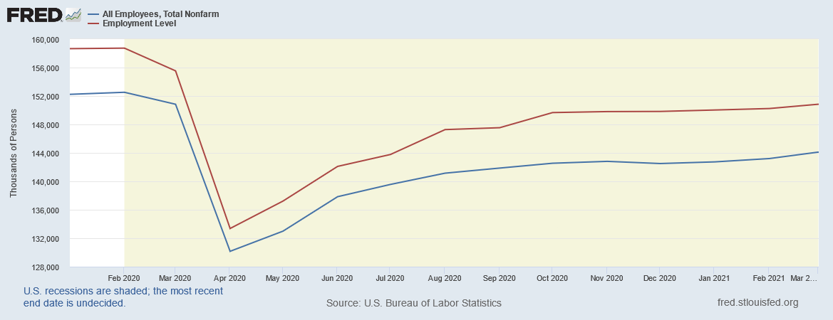
However, there has been a larger decrease in the overall employment level since 2020. This next graph shows the trend of total employees across all sectors in red, and because of the more frequent fluctuations in farming labor than in other industries, the blue line represents the often-cited baseline of “Total Nonfarm” employees. Although there are roughly 4 million more unemployed people, the number of employees has decreased by about twice that amount.

Because of the gap between changes in employment levels and the number of people who are unemployed and looking for a job, the difference often relates to people falling out of the labor force. The graph below shows the Labor Force Participation Rate (LFPR) trend since January 2020. Like the overall employment level, the LFPR plummeted in April 2020, and recovered modestly last Spring, but has since mostly flatlined. March 2021 shows a 0.1% increase from 61.4% to 61.5% since February; while this is nevertheless an increase, more progress is necessary to reverse the losses driven by the Coronavirus pandemic.

As we discussed last time, because of lower labor force participation, and also certain unemployment survey misclassifications, the true unemployment rate is likely greater than the official 6.0% rate. The White House Council of Economic Advisers (CEA) compiled a table estimating adjusted unemployment rates for various demographic groups.
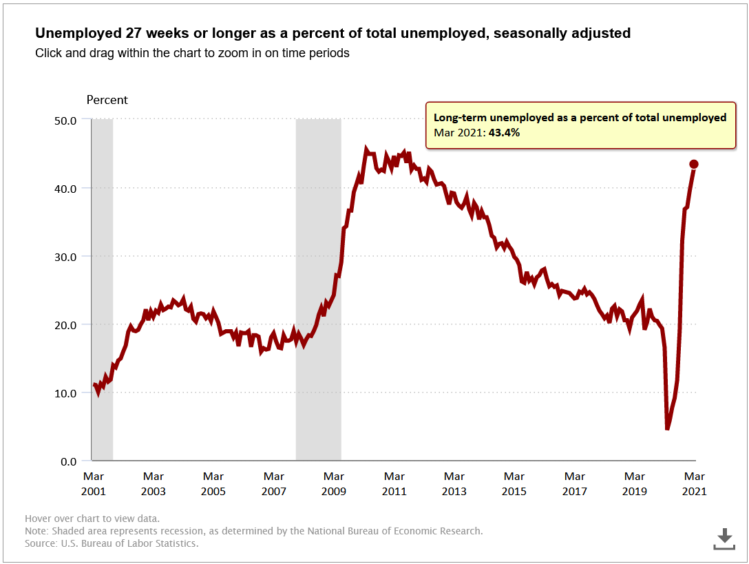
This trend in lower labor force participation may be related to another concerning trend among groups of unemployed people. Although we did gain jobs last month, those who are still unemployed are increasingly part of the long-term unemployed category, or people who have been seeking but unable to find work for 27 weeks or longer. The following BLS graph shows that this group accounts for nearly half of all unemployed people, a level not seen in roughly a decade.

Although these trends indicate that the economy has not yet fully recovered, there are positive signs that even some of the industries most impacted by the Coronavirus pandemic are beginning to rebound.
Employment Situation by Industry
The BLS chart below breaks down which industries lost workers since March 2020. It begins at the top with “Total nonfarm” as the baseline, and shows net job losses in various industries plotted to the left of the vertical line marked “0”. Leisure and hospitality jobs have been the hardest hit throughout the Coronavirus pandemic, as you can see towards the bottom of the chart, with the red dot shown to the left of the line marking 2 million jobs lost.
President Biden’s CEA also prepared a graph arranging similar information in descending order of the percentage of jobs lost in these industries.

Despite the millions of jobs lost in the leisure and hospitality industry, this sector gained many of the jobs added in March 2021. Leisure and hospitality jobs saw the largest sectoral net increase of approximately 280,000 jobs, followed by the construction industry netting roughly 110,000 jobs. This BLS table shows the details of various industries’ job gains and losses over the past three months, alongside March 2020’s figures for extra context.
If these sectors and the economy as a whole maintain this momentum, concerns of a slowing economic recovery could be behind us, but widespread growth and prosperity are certainly not guaranteed.
The Path Forward and Reasons for Cautious Optimism
In January, I referenced a graph comparing the current economic recession to those in the past, reflecting employment data through December 2020.
If you recall the first graph in this current article – which displayed monthly job gains and losses – December 2020 was the first month of net job losses since April 2020. Had this downward trend persisted, the red line representing our current recession may have taken years to get back to where it started, just like the black line representing the sluggish recovery following the Great Recession.
Thankfully, Congress has since passed multiple Coronavirus relief and economic stimulus bills since then, vaccine distribution has gone more smoothly this Spring than in the Winter, and job gains have been increasing each month of 2021. If we can at least maintain this pace of job growth, the CEA estimates we could recover the millions of lost jobs by the end of the year, as demonstrated in the graph below.

You can see the top dotted line represents where we would have been if we had kept relatively slowly but surely creating jobs at roughly the same rate we maintained since turning the corner from the Great Recession of 2007-2009. The dotted line below represents what our employment situation could look like if we maintain the momentum gained in March. Still, this will take considerable effort and monitoring new data as it becomes available, so I look forward to discussing new employment data with you in May.
Thank you for reading my newsletter and taking the effort to learn about making the world a better place. I look forward to hearing your thoughts on how we can make progress towards a more just economy.
-JJ
Updated 6/27/2022 - Updated graph and table captions; italicized signoff; added share buttons


Where I am not an economist, I feel that your writing is very easy to understand. Keep writing because I am really learning something!!!